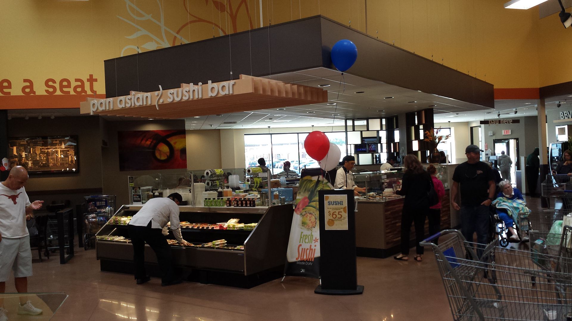
This looks TERRIBLE (maybe it looks better in person than in the photo?). I hope their remerchandising makes up for the horrible looking store. The colors clash and the whole design looks like something from a bad video game from 1992. I'll take their early 2000's railroad or airplane or nautical themed stores with paper blue clouds taped to the ceiling over this any day.
http://www.recorderonline.com/news/save ... c772a.html
Save Mart Porterville, CA Remodeled
-
storewanderer
- Posts: 14995
- Joined: February 23rd, 2009, 3:54 pm
- Has thanked: 3 times
- Been thanked: 346 times
- Contact:
- Status: Offline
-
arizonaguy
- Store Manager

- Posts: 1113
- Joined: July 12th, 2013, 6:07 pm
- Been thanked: 42 times
- Status: Offline
Re: Save Mart Porterville, CA Remodeled
It seems similar, in a way, to the terrible decor that Kroger is remodeling its drop ceiling ex-Smitty's Marketplace stores to in Arizona (complete with the bright colors):storewanderer wrote:This looks TERRIBLE (maybe it looks better in person than in the photo?). I hope their remerchandising makes up for the horrible looking store. The colors clash and the whole design looks like something from a bad video game from 1992. I'll take their early 2000's railroad or airplane or nautical themed stores with paper blue clouds taped to the ceiling over this any day.
http://www.recorderonline.com/news/save ... c772a.html
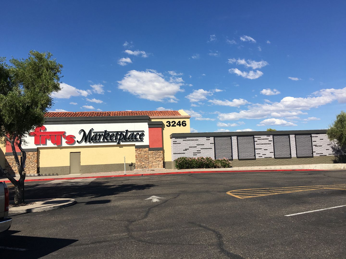
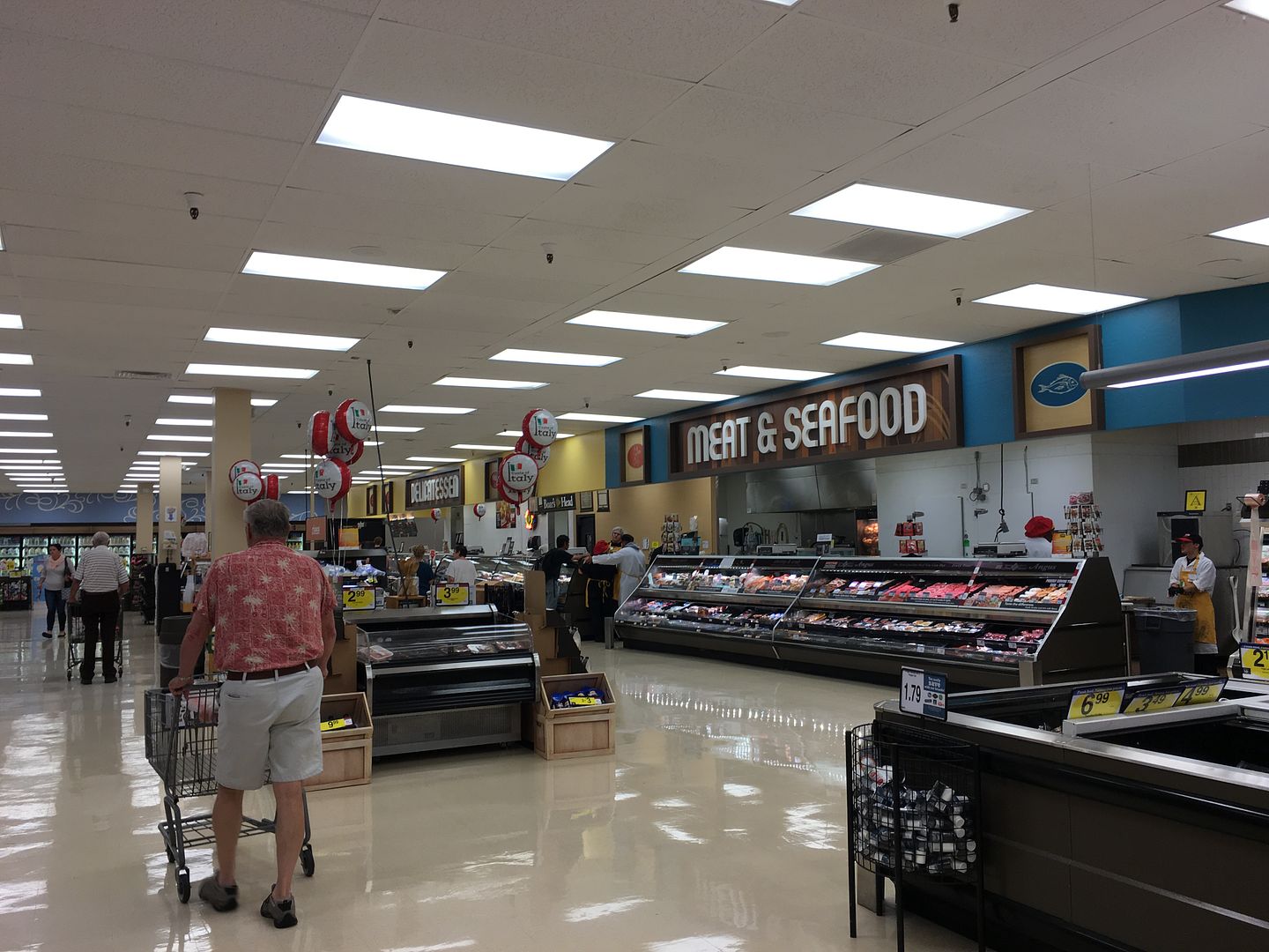
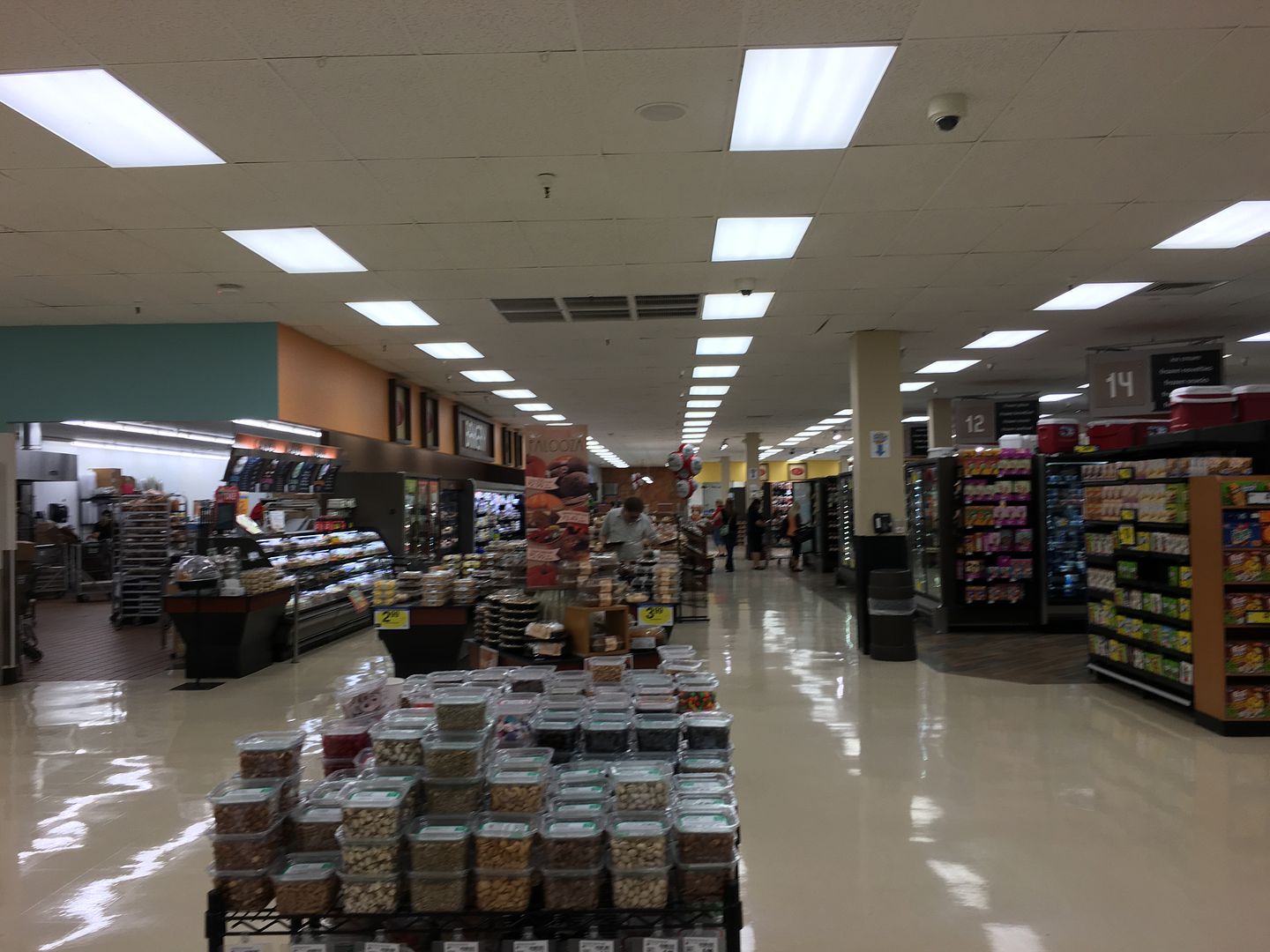
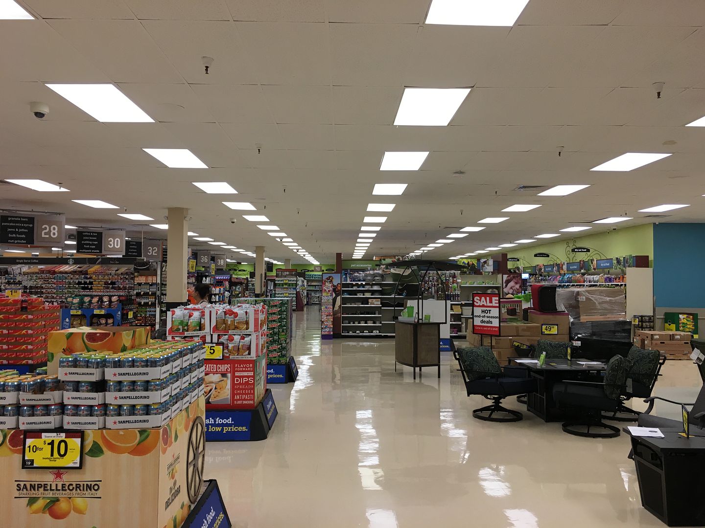
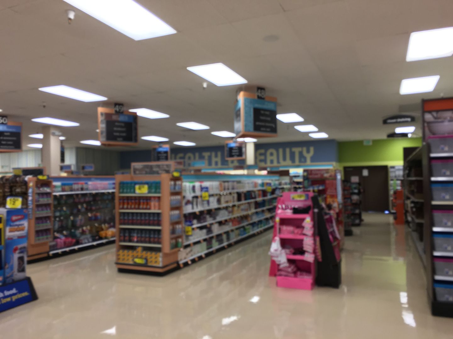
Some design firm probably feels that this style of interior works in supermarkets, but it really looks tacky.
-
storewanderer
- Posts: 14995
- Joined: February 23rd, 2009, 3:54 pm
- Has thanked: 3 times
- Been thanked: 346 times
- Contact:
- Status: Offline
Re: Save Mart Porterville, CA Remodeled
That Frys looks terrible too. I don't like that interior at all especially the font of the wall lettering. It looks cheap, downscale, and low end. Some Fred Meyers in OR/WA that looked rather classy in the past have been downgraded to that interior recently.
Not real impressed with a lot of grocery store interiors lately... to put my feelings nicely. I know some stores don't do much with their walls at all (Whole Foods comes to mind as they often don't have any wall lettering) and frankly not doing much and not having department signs would probably be better than these tacky looks we are seeing.
Not real impressed with a lot of grocery store interiors lately... to put my feelings nicely. I know some stores don't do much with their walls at all (Whole Foods comes to mind as they often don't have any wall lettering) and frankly not doing much and not having department signs would probably be better than these tacky looks we are seeing.
-
SamSpade
- Store Manager

- Posts: 1616
- Joined: September 13th, 2015, 4:39 pm
- Has thanked: 446 times
- Been thanked: 68 times
- Status: Offline
Re: Save Mart Porterville, CA Remodeled
How depressing. Every Kroger store is going to look the same, yet carry different nameplates. Two of the Portland-area QFC's received this treatment (were "fresh fare") and most of the current Fred Meyer remodels are similar.arizonaguy wrote:
It seems similar, in a way, to the terrible decor that Kroger is remodeling its drop ceiling ex-Smitty's Marketplace stores to in Arizona (complete with the bright colors):
Some design firm probably feels that this style of interior works in supermarkets, but it really looks tacky.
As for the Save Mart photo, I think it's a bad photo of the redo that looks a lot like the 'Lucky California' format that was recently shared here.
-
storewanderer
- Posts: 14995
- Joined: February 23rd, 2009, 3:54 pm
- Has thanked: 3 times
- Been thanked: 346 times
- Contact:
- Status: Offline
Re: Save Mart Porterville, CA Remodeled
Kroger has some better interiors at Harris Teeter and Marianos. I hope they discontinue their current interiors as soon as possible and use those.
-
arizonaguy
- Store Manager

- Posts: 1113
- Joined: July 12th, 2013, 6:07 pm
- Been thanked: 42 times
- Status: Offline
Re: Save Mart Porterville, CA Remodeled
Not to get incredibly off topic but Kroger seems to be inconsistent with their new interiors. I don't believe they've renovated any of their non-Marketplace stores into that Marketplace interior.SamSpade wrote:How depressing. Every Kroger store is going to look the same, yet carry different nameplates. Two of the Portland-area QFC's received this treatment (were "fresh fare") and most of the current Fred Meyer remodels are similar.arizonaguy wrote:
It seems similar, in a way, to the terrible decor that Kroger is remodeling its drop ceiling ex-Smitty's Marketplace stores to in Arizona (complete with the bright colors):
Some design firm probably feels that this style of interior works in supermarkets, but it really looks tacky.
As for the Save Mart photo, I think it's a bad photo of the redo that looks a lot like the 'Lucky California' format that was recently shared here.
This is one of their most recent renovated interiors (of a non-Marketplace store). I personally think it looks better than the interior that they're putting in the Marketplace stores:
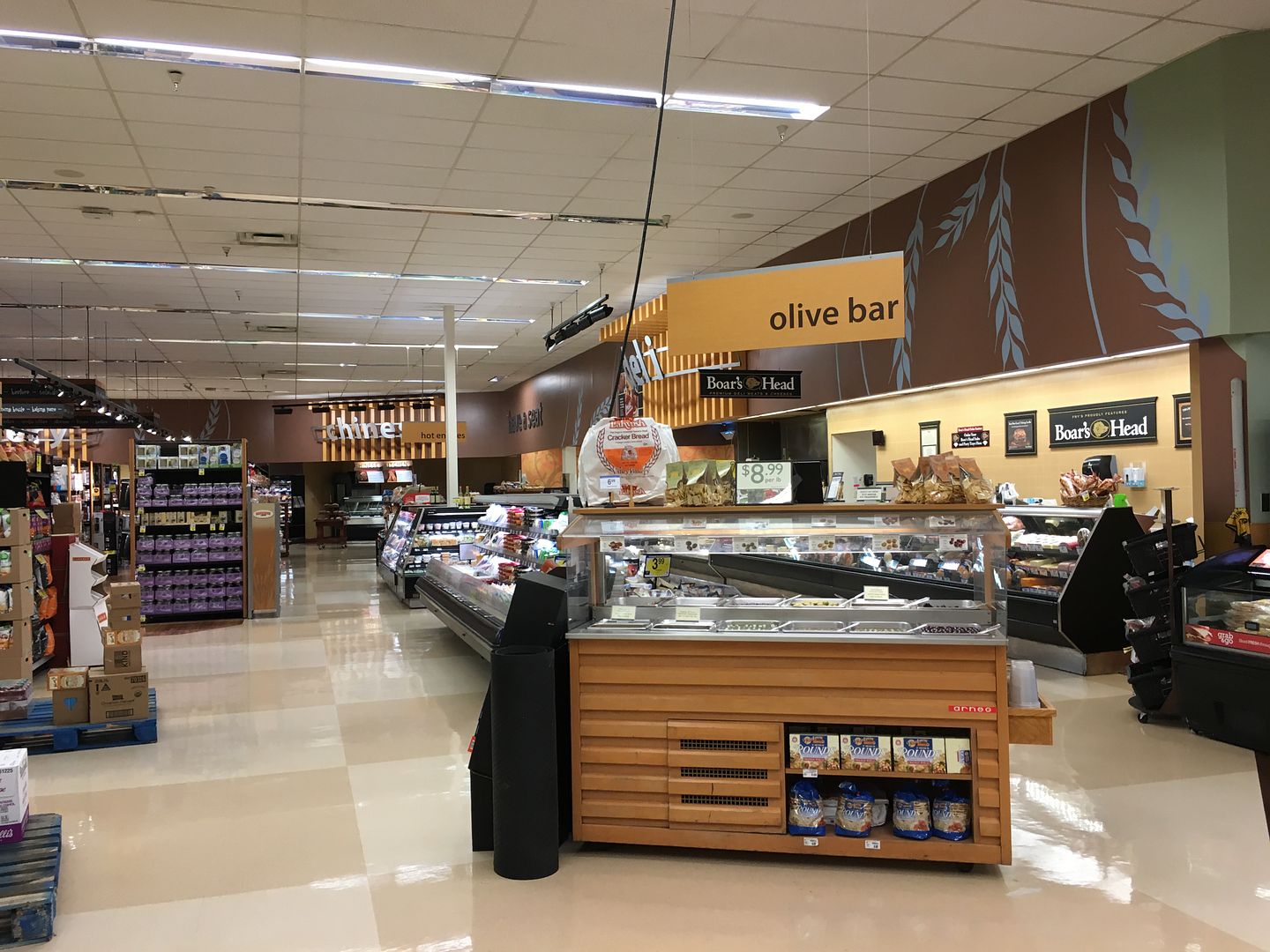
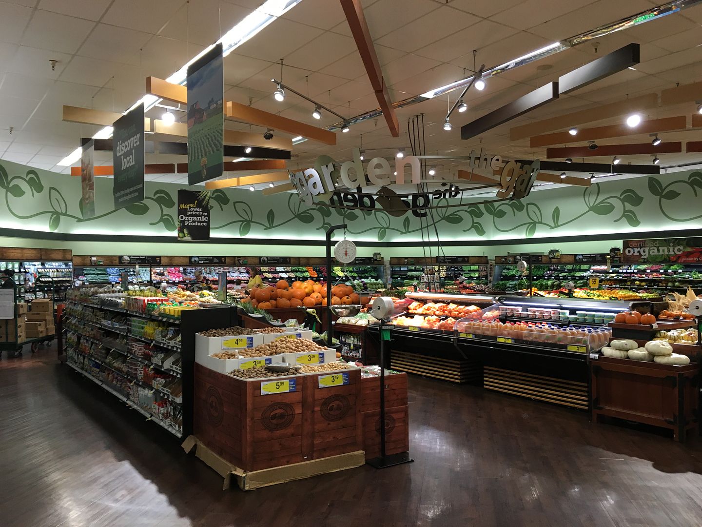
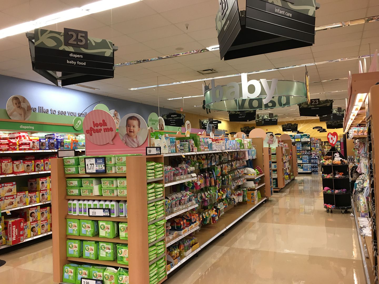
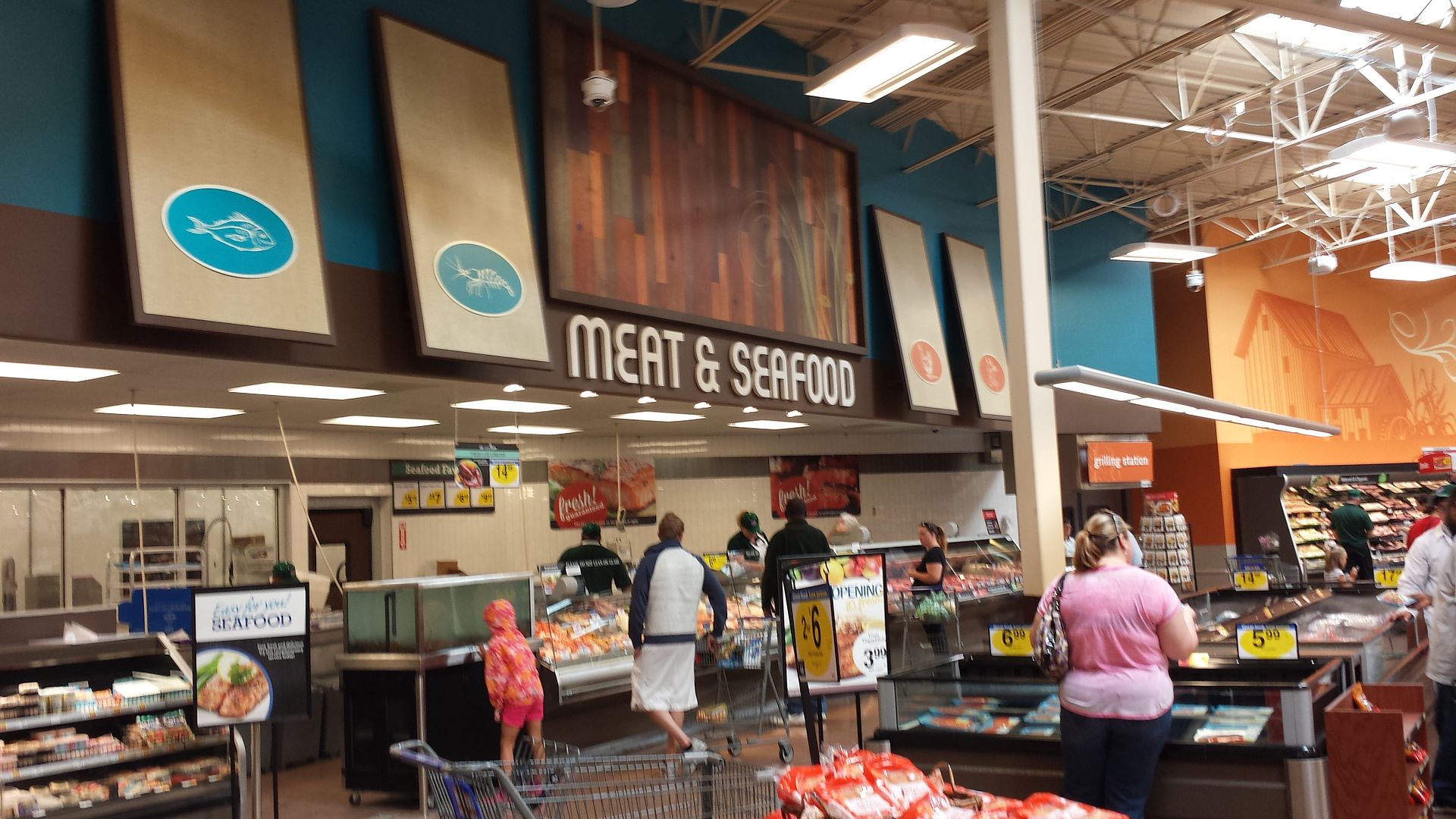
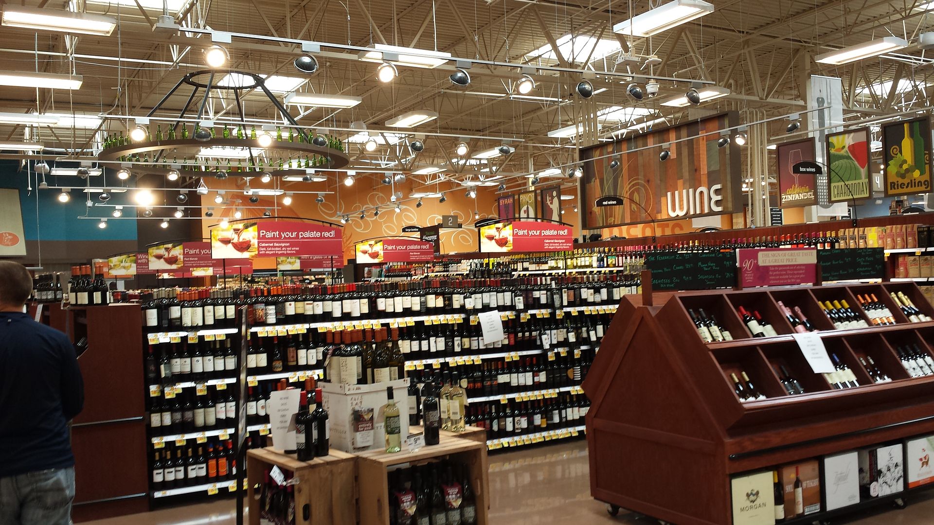
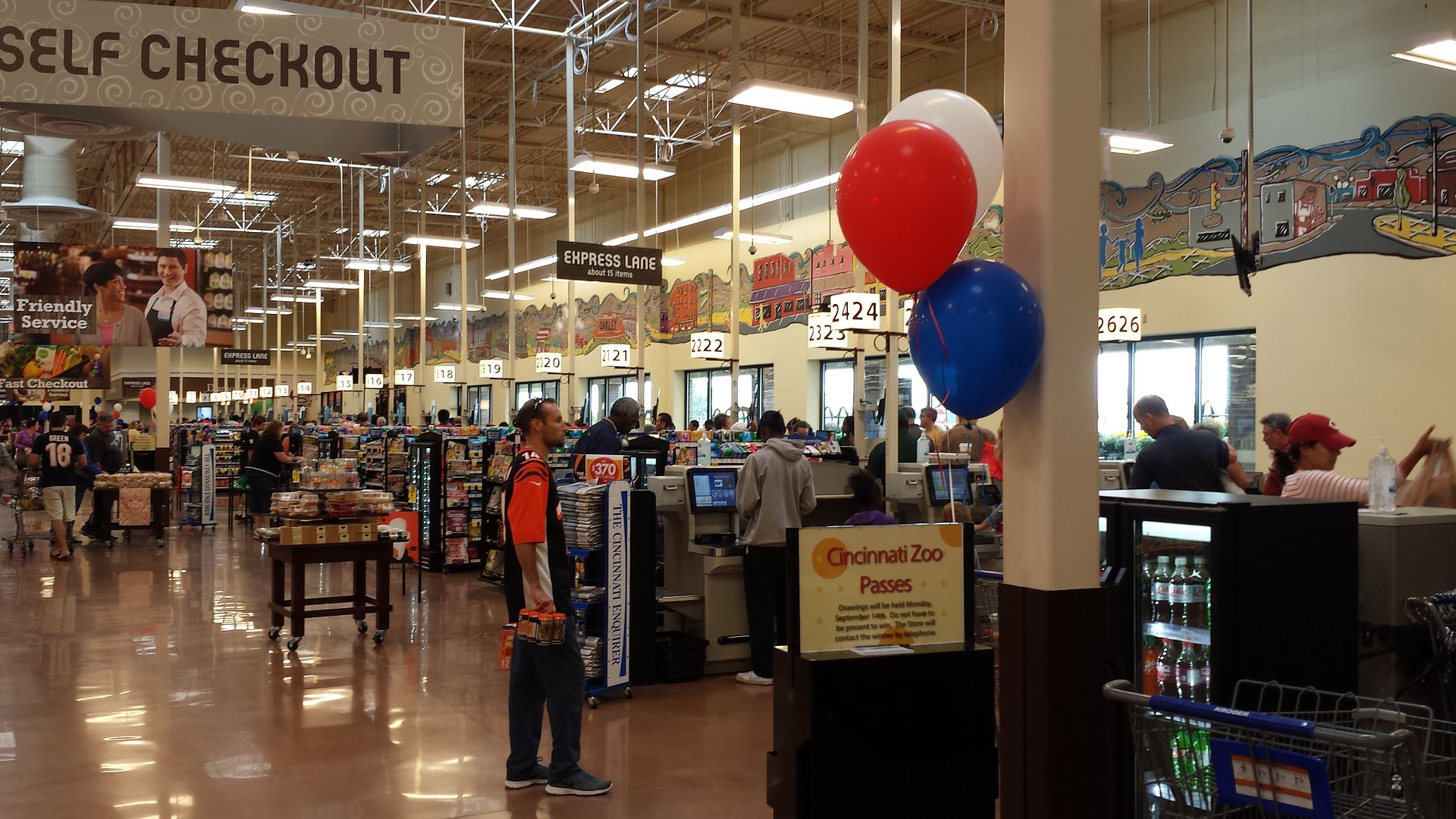
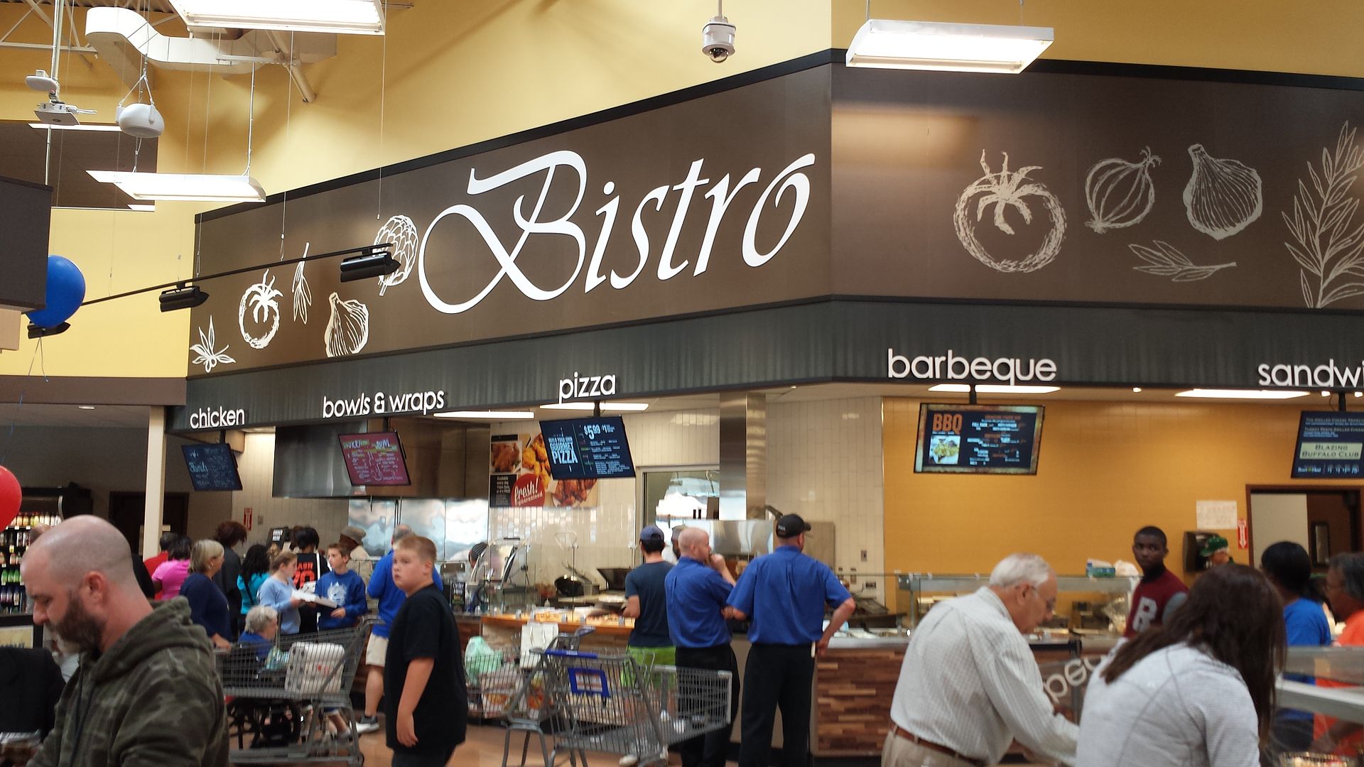
I do have to say that the Marketplace interior looks a lot better in new-build stores without drop ceilings. I took these at the new Kroger Marketplace in Cincinnati:

-
CalItalian
- Store Manager

- Posts: 1121
- Joined: October 1st, 2009, 12:25 pm
- Been thanked: 51 times
- Status: Offline
Re: Save Mart Porterville, CA Remodeled
The latest flooring in remodeled Ralphs locations is better than anything I see in this thread. The flooring in the Kroger is something Ralphs started using 8 years ago and it does not last. It will start to buckle within 2 years or less.
Although I don't believe it is the nicest supermarket I have ever seen, Ralphs now largest store, Westwood Village, is the nicest Kroger store that I have ever seen and a great remodel.
Although I don't believe it is the nicest supermarket I have ever seen, Ralphs now largest store, Westwood Village, is the nicest Kroger store that I have ever seen and a great remodel.
Re: Save Mart Porterville, CA Remodeled
The problem with this store is that ceiling height is just way too low. They should remove the acoustic ceiling tiles and open it up and it would look a lot better. It looks pretty good in the Cincinnati store shown above.